使用svg绘图

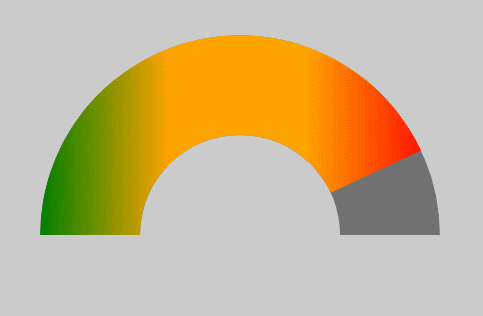
之前项目中遇到一个需求:要求绘制一个半圆环,且半圆环的角度可以根据某数据的多少进行映射改变。大致效果如下图所示。

svg-demo

如果单纯实现一个不会动的彩色半圆环,是十分简单的,想必大家都可以轻松地用几行 css 代码搞定,所以难点就在于如何绘制彩色的扇形圆环,且扇形角度是可以动态改变的。
该效果,应该是可以用css实现的,但是我第一个想法还是利用svg去实现,因为svg实现起来确实是比较简单的。

具体实现代码如下:

下面依次解释各svg标签的功能

  1. <svg>
    svg 根标签
    属性:
    id,class:同普通html标签;
    width,height:svg画布的宽高,可以不加单位,例如:width=100,则表示相对大小,输出时就会采用用户的单位(这里我也不是很明白);
    viewBox:以viewBox="0 0 100 100"为例,表示了画布上可以显示的区域:从(0,0)点开始,100宽*100高的区域,这里表示svg 坐标系x轴最大100个单位,y轴最大也是100个单位,和svg的宽高不是一个概念;

  2. <defs>
    该标签作用是定义一些以后会用到的元素,所以该标签内的元素并不会呈现在画布上;
    在本文中的例子中,内部分别定义了 linearGradient 和 clipPath 标签。

  3. <linearGradient>
    线性渐变标签,用于实现圆环中的彩色渐变填充;
    其中的<stop>标签用于表明渐变保函的颜色,以及各种颜色的出现位置。具体解释可以参考这里

  4. <clipPath>
    剪切标签,这个是重点,用于裁剪出特定的形状。
    这里我们在剪切标签内,放置了一个经过旋转的<path>标签(下面会介绍),用于裁剪出特定角度的彩色圆环。
    剪切标签具体用法可以参考这里

  5. <rect>
    灰色的矩形背景。

  6. <path>
    路径标签,该标签功能很强大,可以绘制各种形状的路径。这里我们使用两个path,第一个用于绘制一个灰色的半圆环,第二个用于绘制一个彩色且被裁剪的半圆环。
    path标签的具体用法参考这里

我们来分步演示

  1. 首先我们来画一个背景
1
2
3
4
 <svg id="bu-dao"  class="icon" width="500px" height="500px" viewBox="0 0 100 100" version="1.1"
xmlns="http://www.w3.org/2000/svg">
<rect width="100%" height="100%" fill="#ccc"></rect>
</svg>
  1. 然后我们来画一个 灰色的半圆环
1
2
3
4
5
6
7
8
9
10
11
 <svg id="bu-dao"  class="icon" width="500px" height="500px" viewBox="0 0 100 100" version="1.1"
xmlns="http://www.w3.org/2000/svg">
<rect width="100%" height="100%" fill="#ccc"></rect>
<path d="M 10 50
A 40 40 0 1 1 90 50
h -20
a 20 20 0 1 0 -40 0
Z
"
fill="#333" fill-opacity=".6"></path>
</svg>
  1. 然后我们在灰色半圆环上面画一个渐变色圆环
1
2
3
4
5
6
7
8
9
10
11
12
13
14
15
16
17
18
19
20
21
22
23
24
25
26
<svg id="bu-dao"  class="icon" width="500px" height="500px" viewBox="0 0 100 100" version="1.1"
xmlns="http://www.w3.org/2000/svg">
<defs>
<linearGradient id="gradient-1" >
<stop stop-color="green" offset="0"/>
<stop stop-color="orange" offset=".33"/>
<stop stop-color="orange" offset=".66"/>
<stop stop-color="red" offset="1"/>
</linearGradient>
</defs>
<rect width="100%" height="100%" fill="#ccc"></rect>
<path d="M 10 50
A 40 40 0 1 1 90 50
h -20
a 20 20 0 1 0 -40 0
Z
"
fill="#333" fill-opacity=".6"></path>
<path d="M 10 50
A 40 40 0 1 1 90 50
h -20
a 20 20 0 1 0 -40 0
Z
"
fill="url(#gradient-1)"></path>
</svg>
  1. 使用裁剪标签 去裁剪彩色半圆环
1
2
3
4
5
6
7
8
9
10
11
12
13
14
15
16
17
18
19
20
21
22
23
24
25
26
27
28
29
30
31
32
33
34
35
<svg id="bu-dao"  class="icon" width="500px" height="500px" viewBox="0 0 100 100" version="1.1"
xmlns="http://www.w3.org/2000/svg">
<defs>
<linearGradient id="gradient-1" >
<stop stop-color="green" offset="0"/>
<stop stop-color="orange" offset=".33"/>
<stop stop-color="orange" offset=".66"/>
<stop stop-color="red" offset="1"/>
</linearGradient>
<clipPath id="sector-clip">
<path d="M 10 50
A 40 40 0 1 1 90 50
Z
"
transform="rotate(-40)"
transform-origin="50 50"
></path>
</clipPath>
</defs>
<rect width="100%" height="100%" fill="#ccc"></rect>
<path d="M 10 50
A 40 40 0 1 1 90 50
h -20
a 20 20 0 1 0 -40 0
Z
"
fill="#333" fill-opacity=".6"></path>
<path d="M 10 50
A 40 40 0 1 1 90 50
h -20
a 20 20 0 1 0 -40 0
Z
"
fill="url(#gradient-1)" clip-path="url(#sector-clip)" ></path>
</svg>

用js改变彩色扇形的角度

获取clipPath 内的path标签然后改变 其 transform='rotate()'内的角度值即可。

关于svg标签的使用细节,可以参考我的上一篇博客,里面有MDN上的svg教程目录

MDN的svg教程